Ad Gefrin is a new distillery in Northumbria, England, with deep roots. They needed a unique typeface for their logo, their whiskey bottle labels, and their gorgeous new distillery headquarters. The branding agency Stranger & Stranger was tasked with the job of designing the Ad Gefrin branding and packaging. They developed the concept for a logotype that reflected the archeological findings on Northern England and visually suggested that pieces of history were coming together to form something new.
Together, we explored many possible options, and landed on a modern yet timeless stencil design – perfect for Ad Gefrin to apply in a wide variety of signage and merchandise.
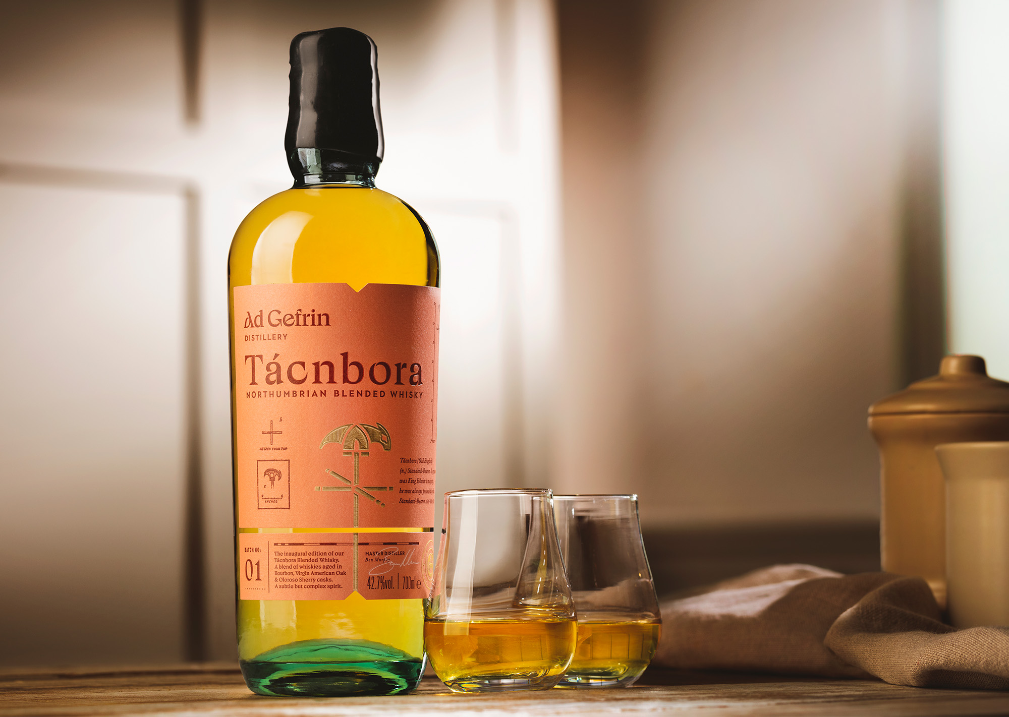
The concept of Northumbrian history gave us a wide array of possible starting points. After all, the Celts in the area are the very same who authored The Book of Kells.
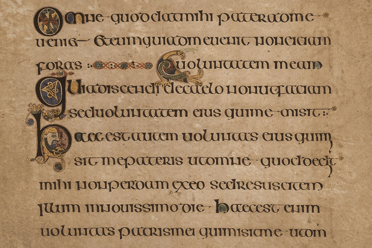
Between the initial concept presented by Stranger & Stranger and the wonderful source material, I explored several possible directions for a modern yet timeless logotype. A core concept behind the brand identity was the idea of archaeological artifacts, dug up from the past. So, from the start, S&S wanted glyphs to be drawn in a stencil style, with multiple shards coming together to create meaning.
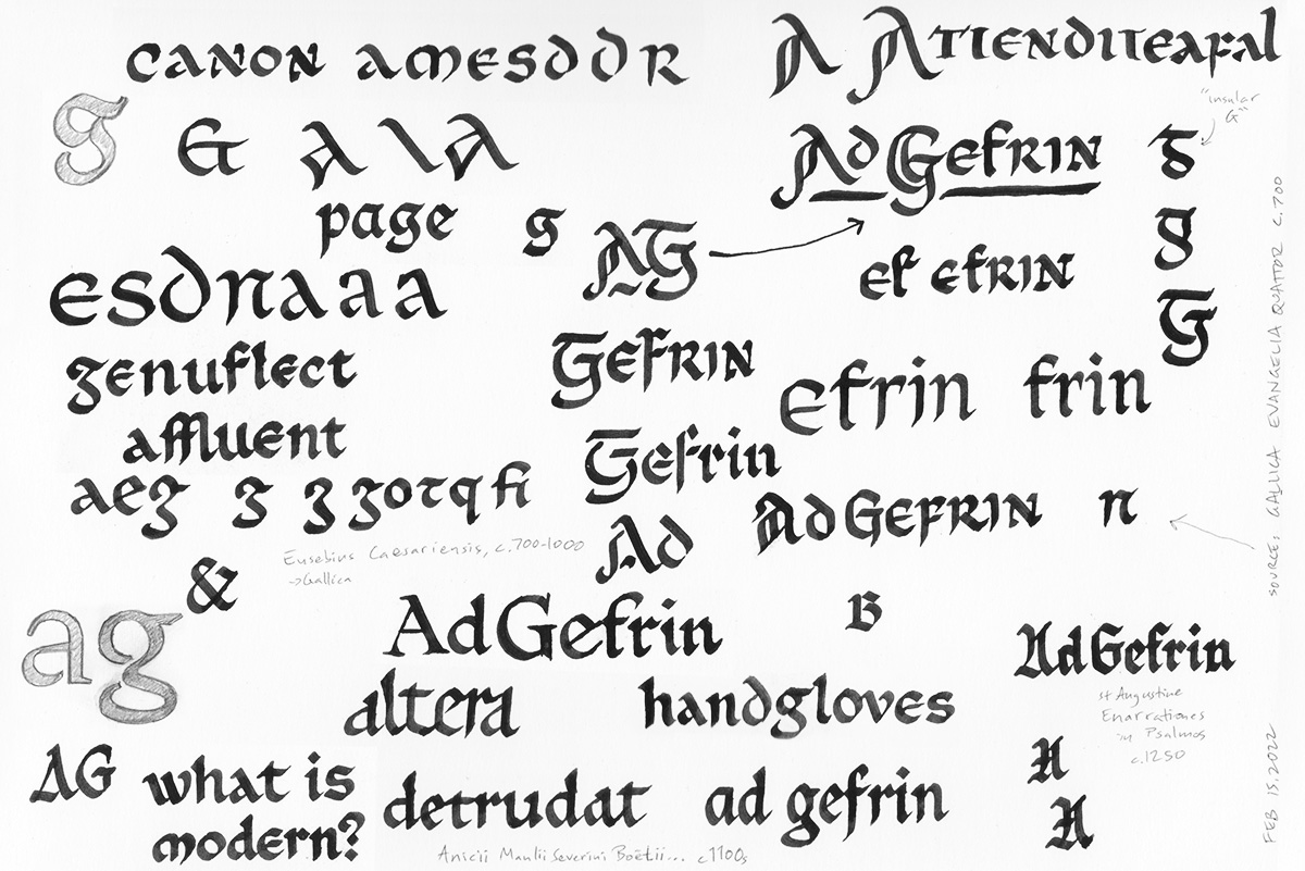
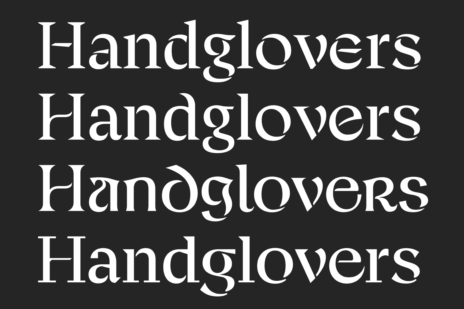
My early concepts were a little too closely tied to historical references, but with a few rounds of feedback, we were able to to find the sweet spot: something that was contemporary and graceful, yet captured some of the details and surprises of history.
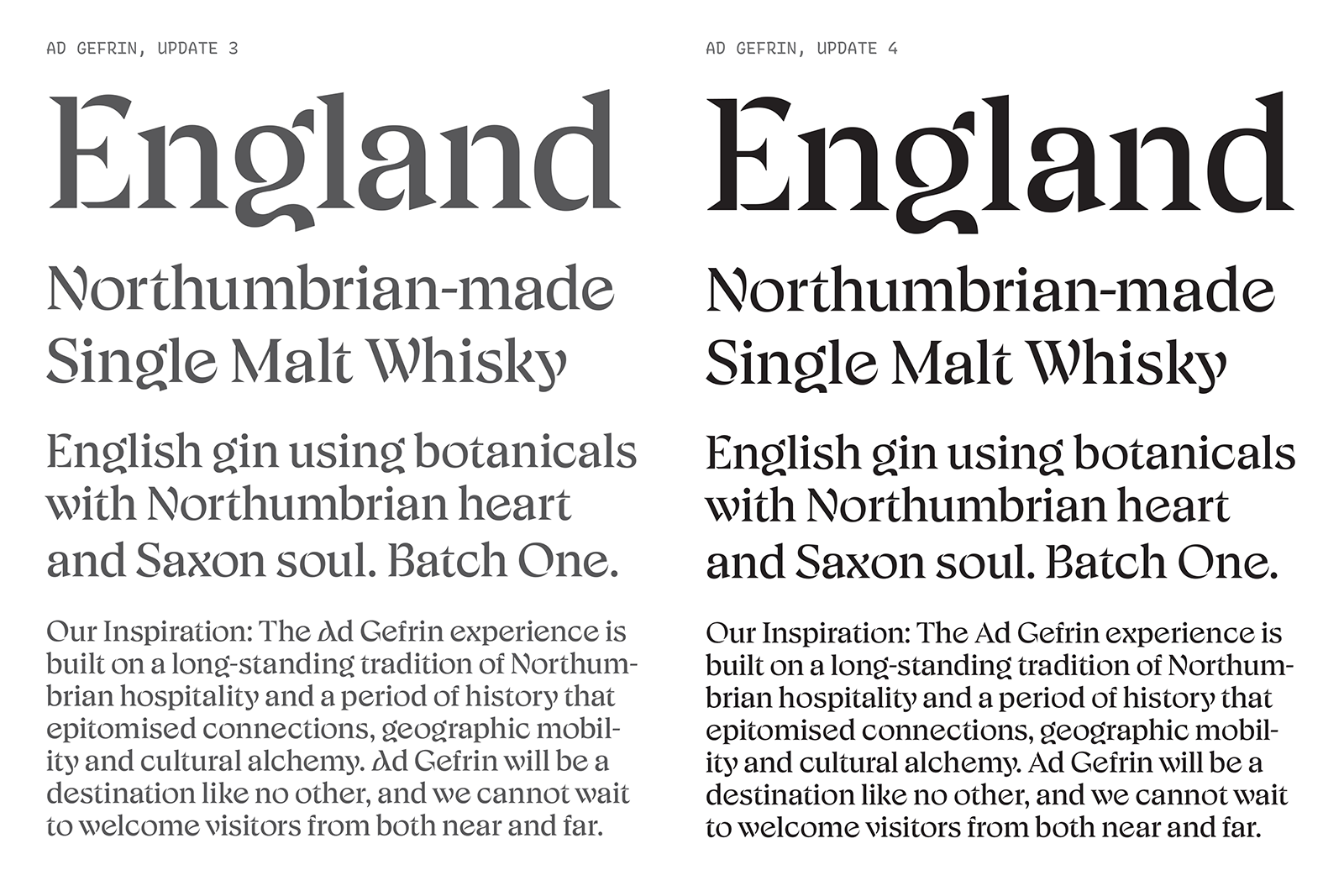
The project had a relatively quick timeline of just 8 weeks, so it was a sprint to settle on a direction, then expand and refine this to create a well-crafted, fully featured typeface, with enough language support to ensure that Ad Gefrin could accurately write in English, without worries about characters missing in loan words and foreign names. As a bonus, we even added support for the archaic forms of G, g, and s found in Old English texts!


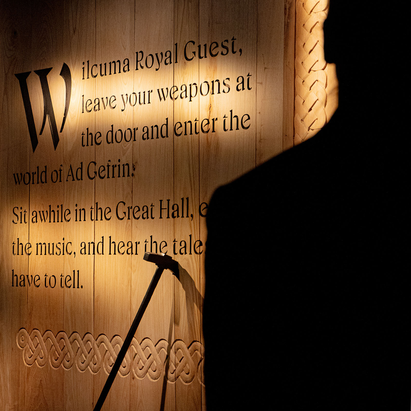
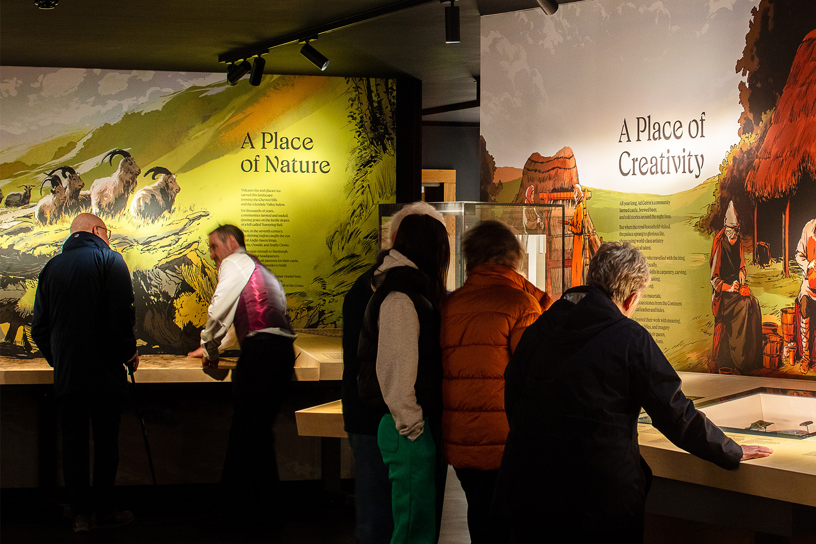
Over the past few months, it’s been so fun to see Ad Gefrin rolling out their branding and bespoke typography for not only product packaging, but also for the signage of their beautiful distillery and museum. The distillery and museum really looks like a beautiful site to visit, and I am proud to have played a small role in that.
Thanks to Stranger & Stranger for looping me in on the project, for bringing a beautiful concept to the table, and for generally being a great client and collaborator! Special thanks to Rowan Miller, the Creative Director on the overall brand project, Pierre Kermorvant, the Senior Designer who provided direct art direction on the typeface, and Clare Vickers, a Creative Services Director who maintained excellent coordination and communication throughout the effort.
I can’t wait to see where Ad Gefrin takes things next!